Jack in the Box Rebrand
Jack in the Box Rebrand
Jack in the Box Rebrand
Jack in the Box
Rebrand

Jack is back.
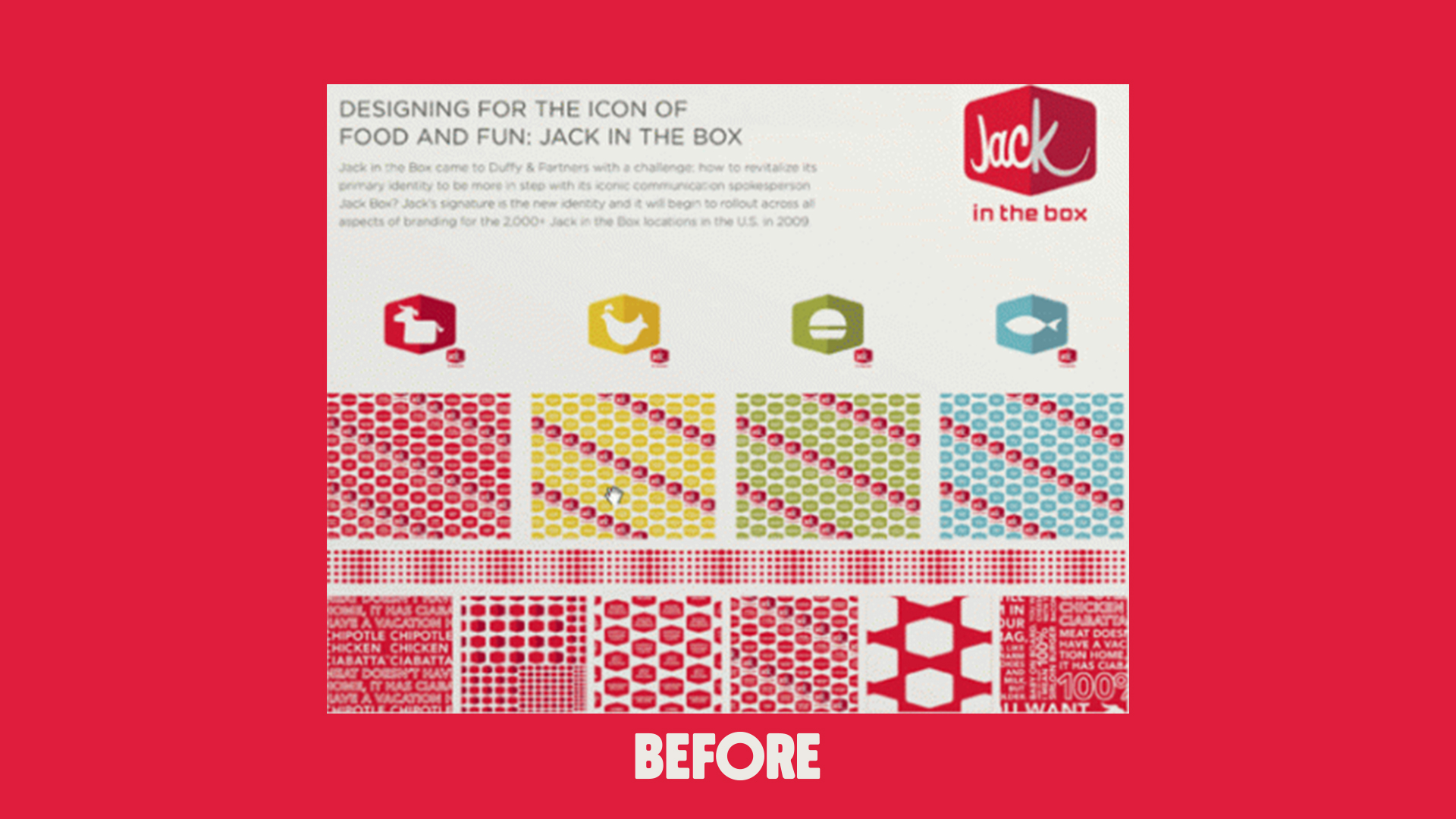
When Jack in the Box started thinking about a rebrand, they called up all the hot branding agencies to pitch for the business. We asked if we could throw our hats in the ring, too. As the lead designer and art director, I won the project over all those cool branding shops with a vision of celebrating Jack as an icon.
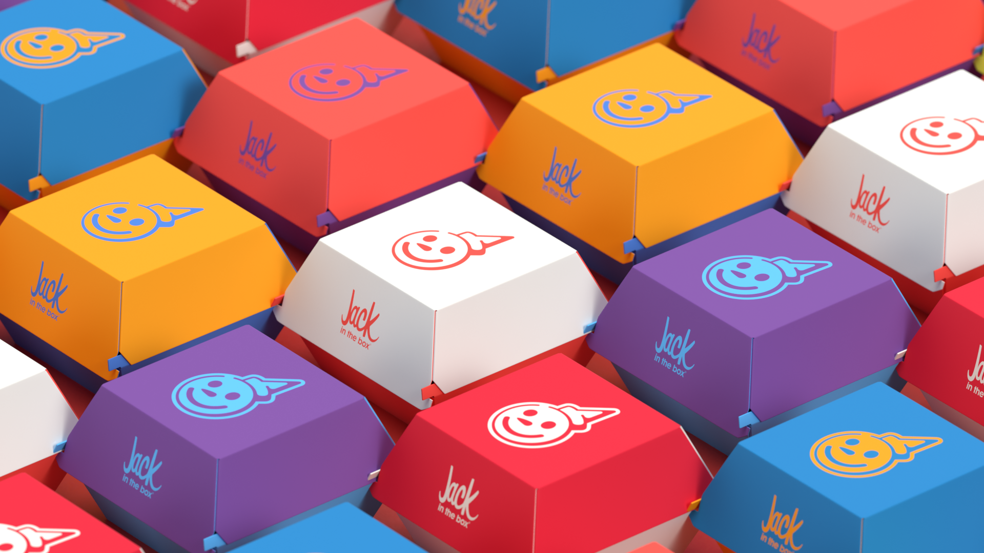
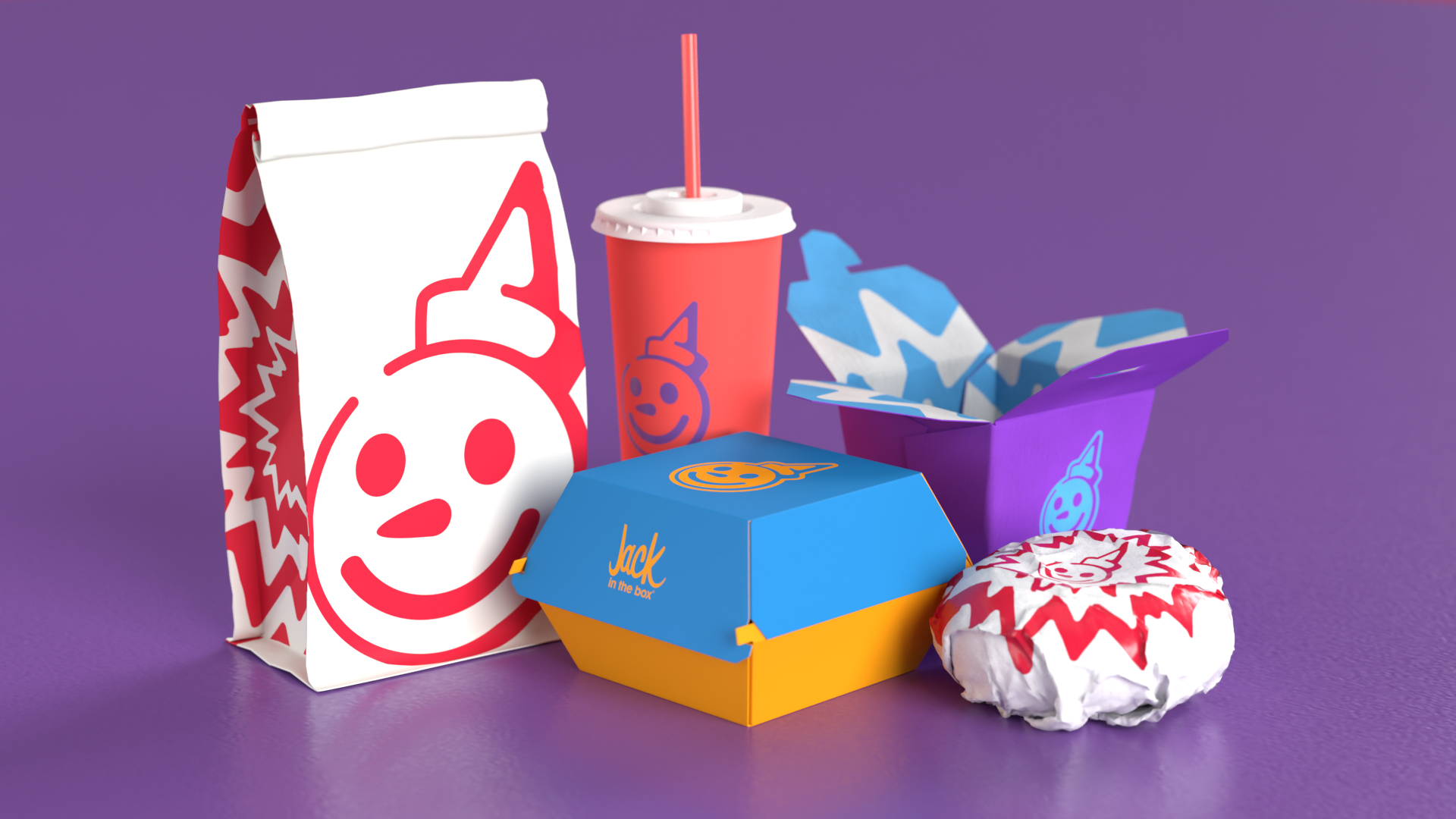
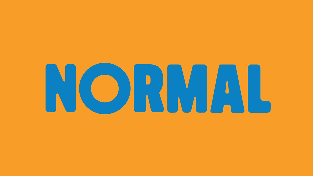
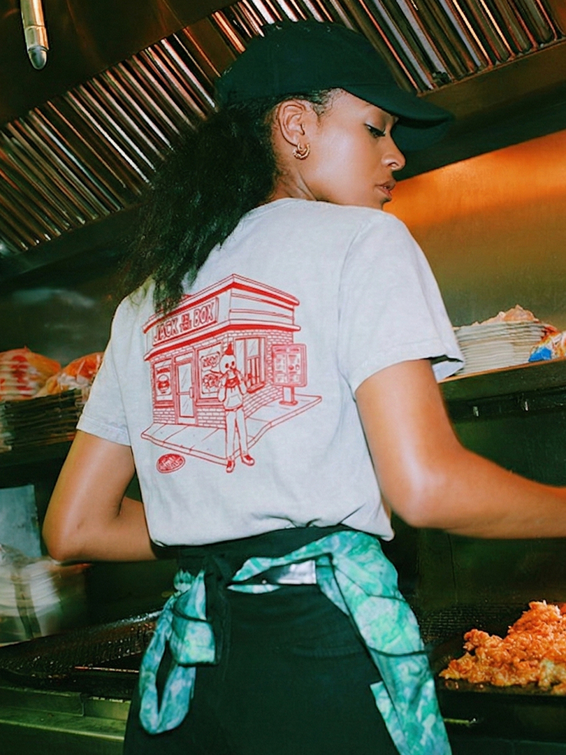
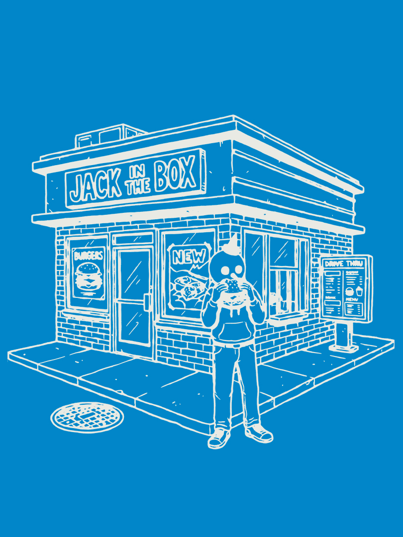
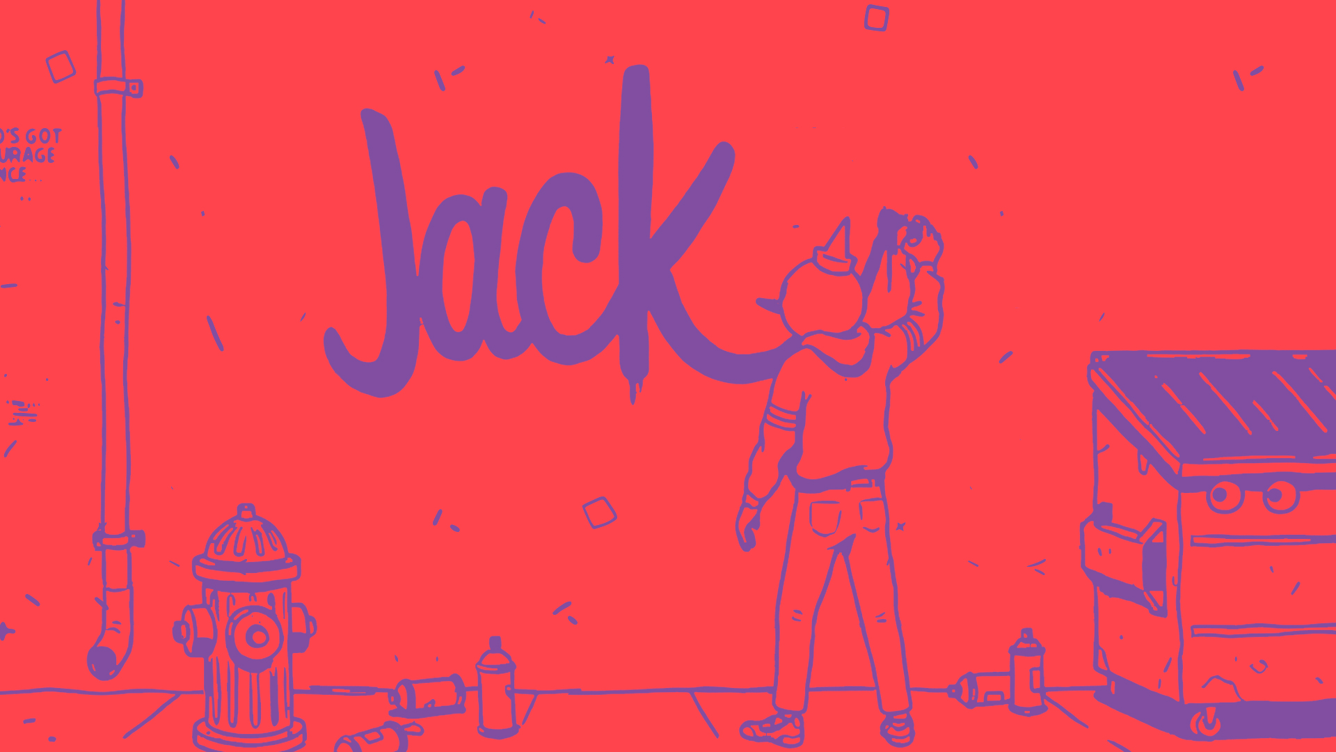
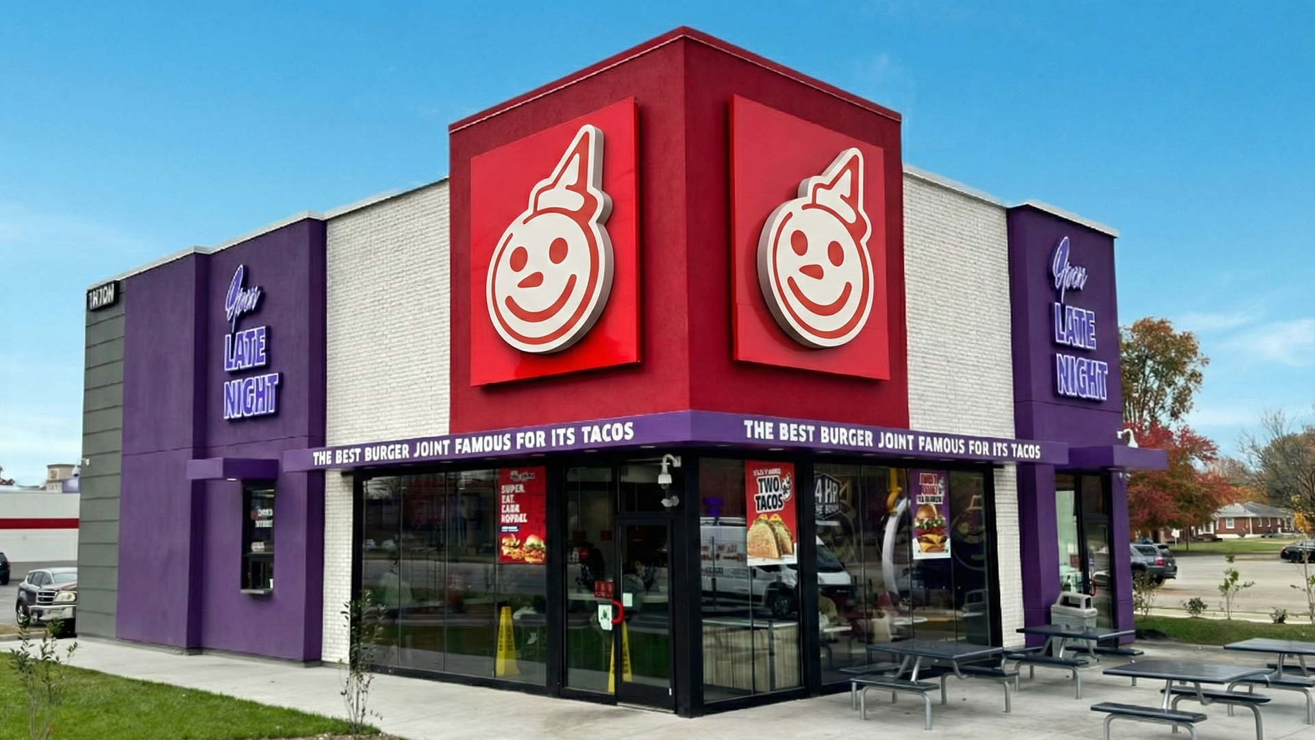
For over 30 years, Jack was part of the Jack in the Box logo until he was taken out in 1980. As part of the brand's biggest rebrand effort in over a decade, I was wanted to bring back what people love most about the brand: Jack himself. I created the new logo to pay heritage to design elements of the old Jack-centric logos, with a refined, simple, and confident look.


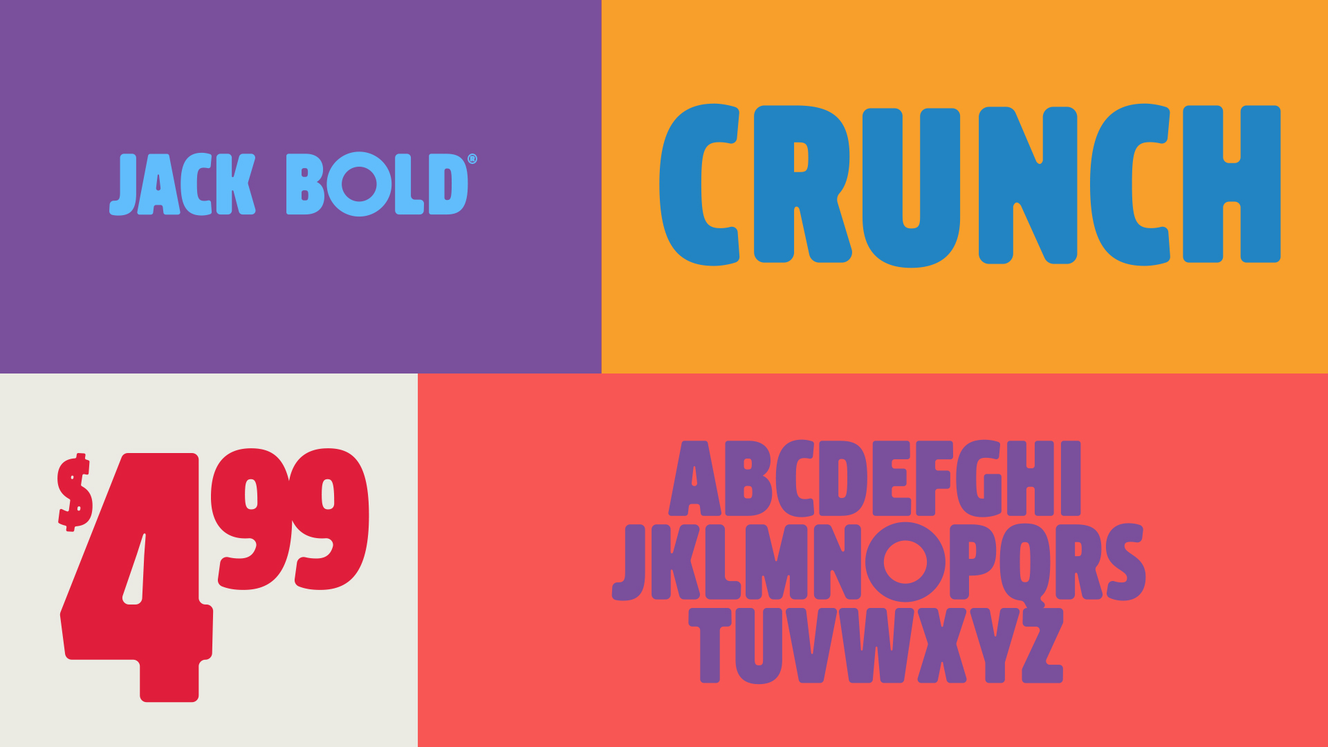
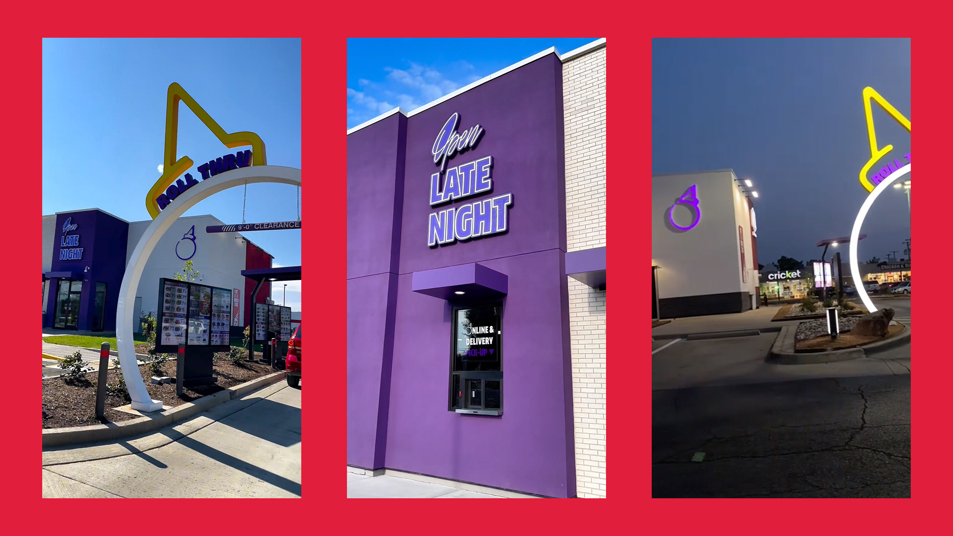
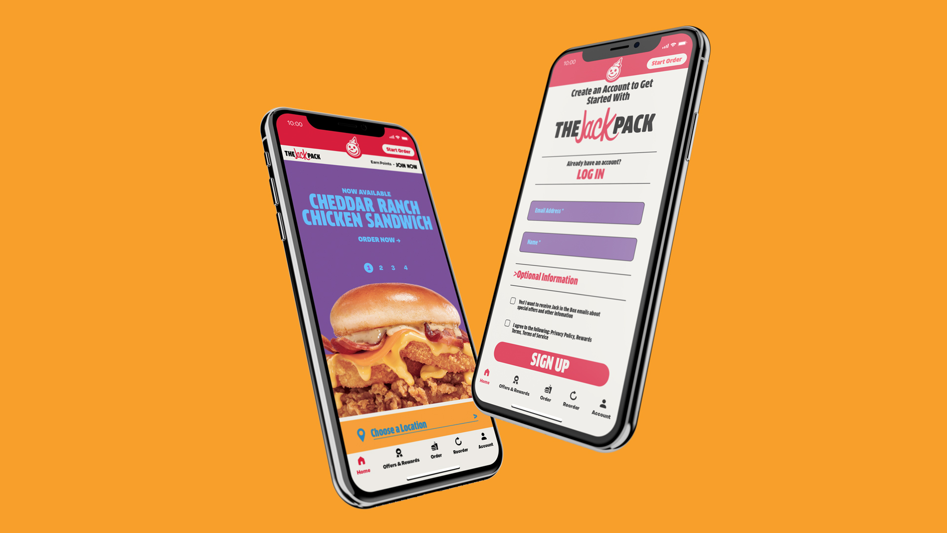
We introduced a new custom font for the brand, Jack Bold. The design takes cues from the curves and arches of Jack himself to create a seamless look. The typeface was introduced across the brand, from in-store to all communications, evoking a sense of playful youth for the brand.
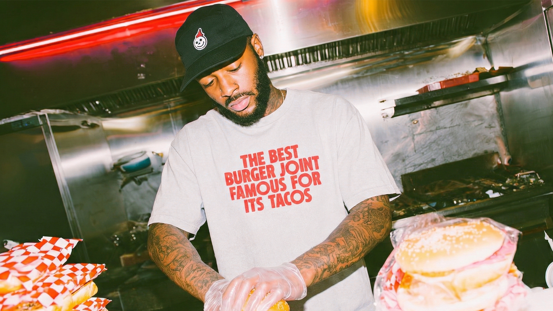
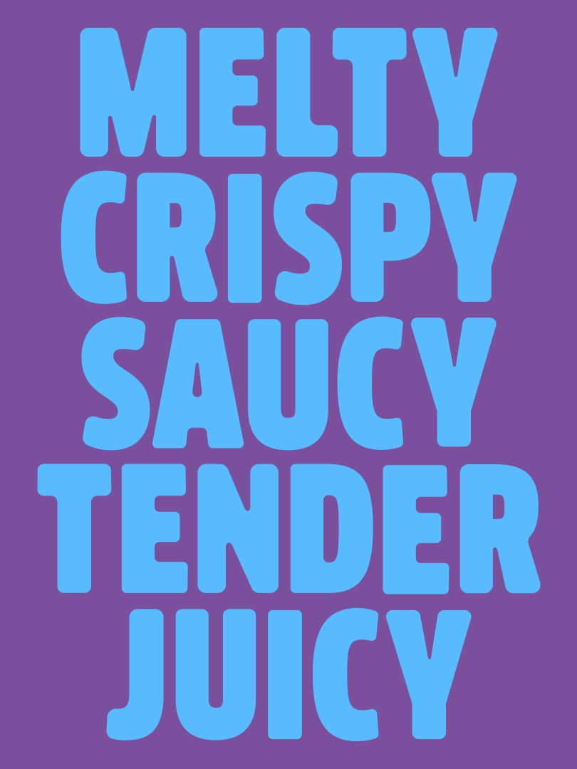
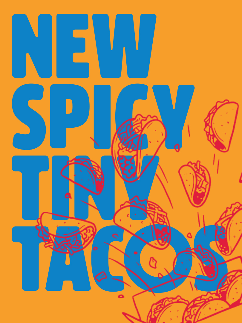
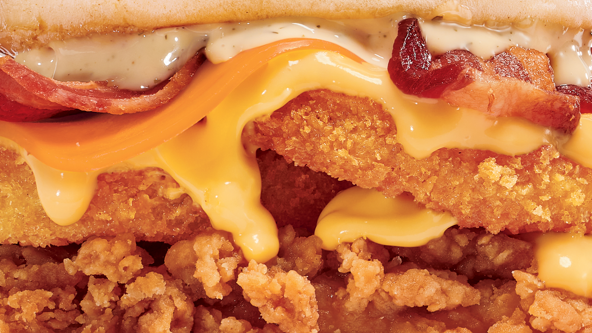
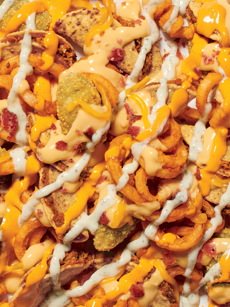
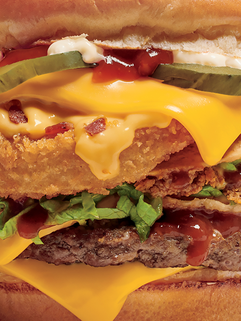
We brought a new illustration style forward that showcases the brand's irreverant personality. A new photography style embraced the drippyness, messiness, and all the other beautiful imperfections that make their food so over-the-top craveable.
From signage to the arch of the drive-thru itself, we brought the new branding to the in-store experience.
Client
Jack in the Box
Role
Lead Designer/
Art Director
Agency
David&Goliath
©2025 Tucker Stosic
tmstosic@gmail.com